
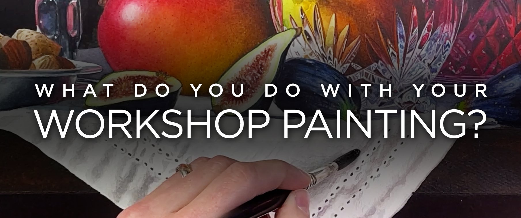
What Do You Do with a Workshop Painting?
In almost every workshop I teach, I inevitably get a series of questions concerning what students can and can’t do with their paintings from class.
Some questions are pretty straight forward with easy answers. “Can I enter this painting in an exhibition?” No. Almost every prospectus I’ve read clearly prohibits student work from competition. For example, here’s a fairly comprehensive rule from the National Watercolor Society on originality (emphasis added):
“Source material must be original and not derived from published images. ‘Original’ means the painting is the artist’s own idea, composition, and design, painted by hand (not computer generated), nor done in a class or workshop, nor repainted from another painting by the same artist from the exact same source image. Photo reference material must have been taken by you.”
Other questions can be more complicated to answer:
“Should I sign a painting done in a workshop? If so, is there a proper way to sign while being transparent about it being a copy?”
“If I copy a master artist, should I copy their signature as well?”
“Can I frame this painting and display it in my home?”
“Can I sell this painting if someone wants to buy it?”
“Can I put this painting in a gallery or my online store/website?”
“What about social media?”
Answers to these questions are not necessarily black and white, and copying art for educational purposes can be a controversial topic in the art world. While some argue that it is a valuable method to learn and improve artistic skills, others believe that copying devalues original artwork and undermines artistic integrity.
It’s important to understand that in a classroom setting, I am teaching and demonstrating painting techniques using my own original work. Students are copying everything from composition and design to brush choices and color palette.
I own the copyright of my work and copyright violations can come with serious legal consequences. I’m obviously not a lawyer, and I’m not giving legal advice, but I think it’s important for artists and students to carefully consider these issues.
Some of my artist friends are very strict when it comes to copying—they don’t allow it. They are very protective of their original work and I certainly understand this, especially in todays AI digital age.
My personal approach is a little more nuanced in that my style of teaching allows students to work with me through a painting, start to finish, essentially copying what I do and thereby learning from my process.
I’m probably more open to this approach because I learned a great deal from copying masters while I was in art school. In fact, art academies and ateliers have a long history of copying masters as an important part of the learning process.

A copyist working at the Met in the European Paintings galleries, ca. 1902–29
Perhaps you’ve been to museums and seen artists with easels set up, copying old master works that are on view. Many museums have copyist programs, and I think they are a great way to learn from the past. The Metropolitan Museum of Art and the National Gallery of Art are just a couple of the institutions with this type of program.
So I have no objection to students learning through this method of study. What happens next is where the thorny questions raised above come into play.
Can you sell a workshop painting? I wouldn’t, but I suppose there’s nothing I can do to stop you from a private sale. Certainly no reputable gallery would sell a copied artwork as an original. There’s a name for that sort of thing: forgery.
I also would not put a workshop painting on my website, or online store. It is not your original work, and misleading others into thinking it is wholly your creation is dishonest.
Regarding social media, I have no problem with people sharing what they have created in class as long as I’m tagged and it’s clear we were working together. It’s wonderful to share what you’ve accomplished and get feedback from your friends, while at the same time building your confidence in what you can achieve when you work hard. Sharing on social media also helps me by promoting my classes, which I certainly appreciate.
In my view, the important thing is attribution. Make sure it’s clear the painting is copied from someone else. When I was in art school I would sign copies like this:
Matthew Bird after William Bouguereau
Here’s an example from my Lemons & Silver Online Class, Carolina uses the French “après” for after:

Carolina Dealy signed her workshop painting with attribution.
I think this is a good way to sign a workshop painting. It allows students to show what they’ve accomplished while also acknowledging that it is not an original work and was done with aid of another artist.
To sum up, copying art with permission in a learning environment has a long and fruitful tradition. Copying art without proper permission or acknowledgement can infringe upon the rights of the original artist. It can undermine their creative ownership and potentially lead to legal consequences.
I’m sure there is much more to say on this topic and I’d love to hear your thoughts. Do you think workshop paintings should be sold? What are your views on copying masterworks? What are some things I’ve overlooked? Let me know in the comments below.
Off-the-Cuff Thoughts on Online Shows

Thoughts on On-Live Shows
April 2020
All my exhibitions and shows have been either postponed, canceled or moved online. The steps are necessary during these times of isolation, and make me wonder what the future will be once we all figure out what "normal" will be on the other side of this.
At National Watercolor Society, we have had many discussions about our exhibition schedule, and after hours of debate, the board decided to move all shows online, including the 100th International Open Exhibition. This was, of course, very disappointing, as we had already planned some pretty amazing events for the centennial celebration. But it's the prudent thing to do.
Some artists I've talked to are excited about shows moving online, and there are some definite advantages. We won't have to pay for shipping charges and handling fees. Depending on the prospectus, it may be possible to enter work that has already sold, art which would not be available for a physical show. New paintings won't necessarily have to be framed right away either. Plus, galleries and museums won't need workers or volunteers to hang paintings.
On the other hand, I like to see art in person whenever possible. Things look different on a screen. Everything is viewed from the same distance, regardless of the size. There is no sense of scale.
As an artist, one of the joys in seeing paintings in person is getting up close to see subtle detail, masterful brush strokes, and gain a better appreciation for technique. For example, can you tell if a paper is hot or cold press on a screen? Generally I cannot.
Additionally, certain artistic styles could arguably be at a disadvantage in online galleries. Tonalist painters for example, or experimental artists that incorporate a third dimension to a painting. Certain paints such as iridescent or fluorescent pigments would not translate on a screen.
And then there is the frame, a contentious issue even in physical shows. Usually on line galleries only show the painting. So is an unseen frame included in a sale?
No doubt there are other drawbacks for the viewer or collector, but what about the jurying process. It's one thing to select a show from digital images. But what about the awards? For top shows that offer tens of thousands of dollars in prize money, jurors usually want to see the real deal in order to make the best decision, especially if it is a purchase prize.
These are strange times, and it's understandable that exceptions will have to be made. We're being flexible as we adapt to continued uncertainty. But I hope it's not the new normal, and the day will quickly come when we can all view art in person again.
I'd love to hear your thoughts on the movement to online exhibitions. Does the good out weigh the bad?
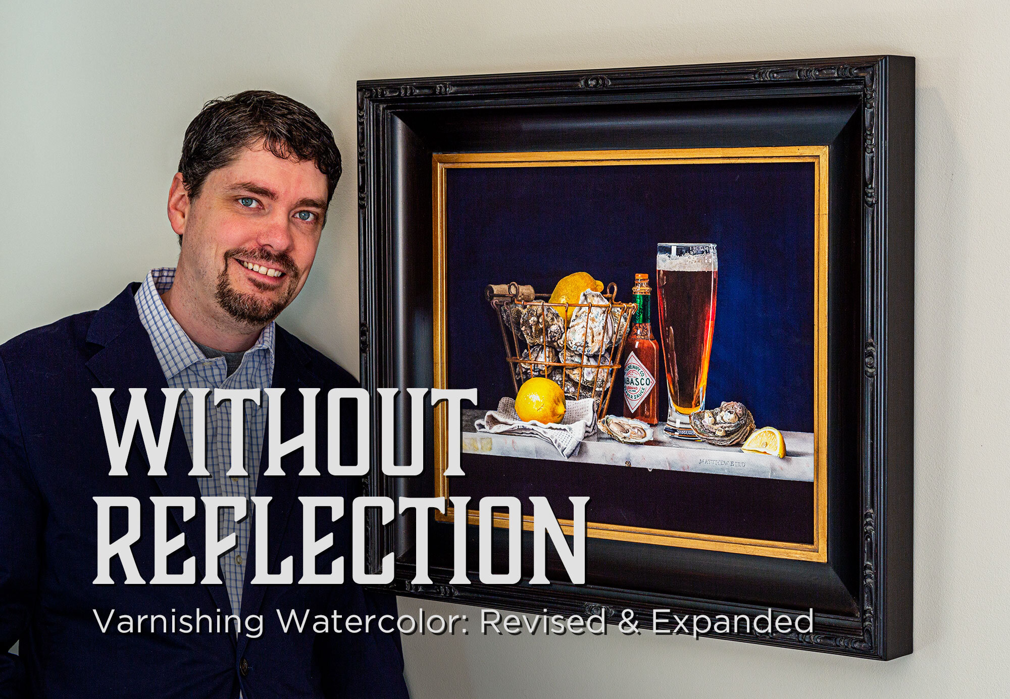
Without Reflection: Varnishing Watercolor Revised & Expanded
Click Here: List of friendly Watercolor Societies for Varnished Work
My favorite studio moments are right before I sign a painting. When it’s successful, there’s nothing like stepping back and seeing the finished watercolor on the easel. I wish everyone could view my work this way — the way I see it in the studio. Not when it’s behind a glass barrier that separates the viewer, and reflects the room’s surroundings like an aspiring mirror.
This is one of several reasons that I began searching for a more novel approach to display my watercolors. A way to varnish or coat them, to break the glass barrier that held back enjoyment of the art, higher sale prices, and appeal to gallery owners.
I had heard of a handful of watercolorists who had varnished their watercolors, but at the time, it was like trying to find the lost basement recordings of your favorite band. There wasn’t much information out there about the techniques, or what the best practice was.
There were a lot of questions about permanence or longevity, and a lot of claims from both artists and manufacturers. But just because a product says “archival” on the label, how do we really know that it is? If someone tells me using wax medium is a great idea, can I trust that? (I’m not so sure that it is.) What do museums and conservators think about what artists are doing, and does it even matter?
As I write this, years later, there is a growing interest in varnishing watercolors, and there is more information available than ever before. Some of it is confusing, some contradictory. I’ve learned a great deal, and I’m happy to share it. But first, the obligatory disclaimer: I’m not a chemist, conservator or expert of any sort, so I have relied heavily on those who are. And the journey has taken me to points near and far.
The paper I use is from Fabriano, Italy, and I’ve been there to see how it’s made. I’ve gone behind the scenes in Seattle to learn how Daniel Smith paints are ground, and talked to their chemist about pigments and testing for lightfastness. I’ve toured the Golden Artist Colors facility in New York, and talked to the fine people there about Aquazol, varnishes, and conservation methods.
All this is to say I’m serious about getting the best information I can, and I’m committed to sharing what I continue to learn. But always do your own homework. I’m not paid by any of the companies I recommend. There are lots of great products out there. Naturally some are better than others. Experiment for yourself and find what you like.
The Substrate
Varnishing requires a rigid surface, so let’s start with the support and progress from there to the final top coat.
I’ve written before about why I like panels, and aluminum composite material (ACM) is a durable, light-weight, archival surface that won’t warp or bend with humidity, temperature change or corrode if properly sealed. I’ve tried other panels, and I know some artists like Gatorform, but it contains chemicals not welcome in preservation settings.
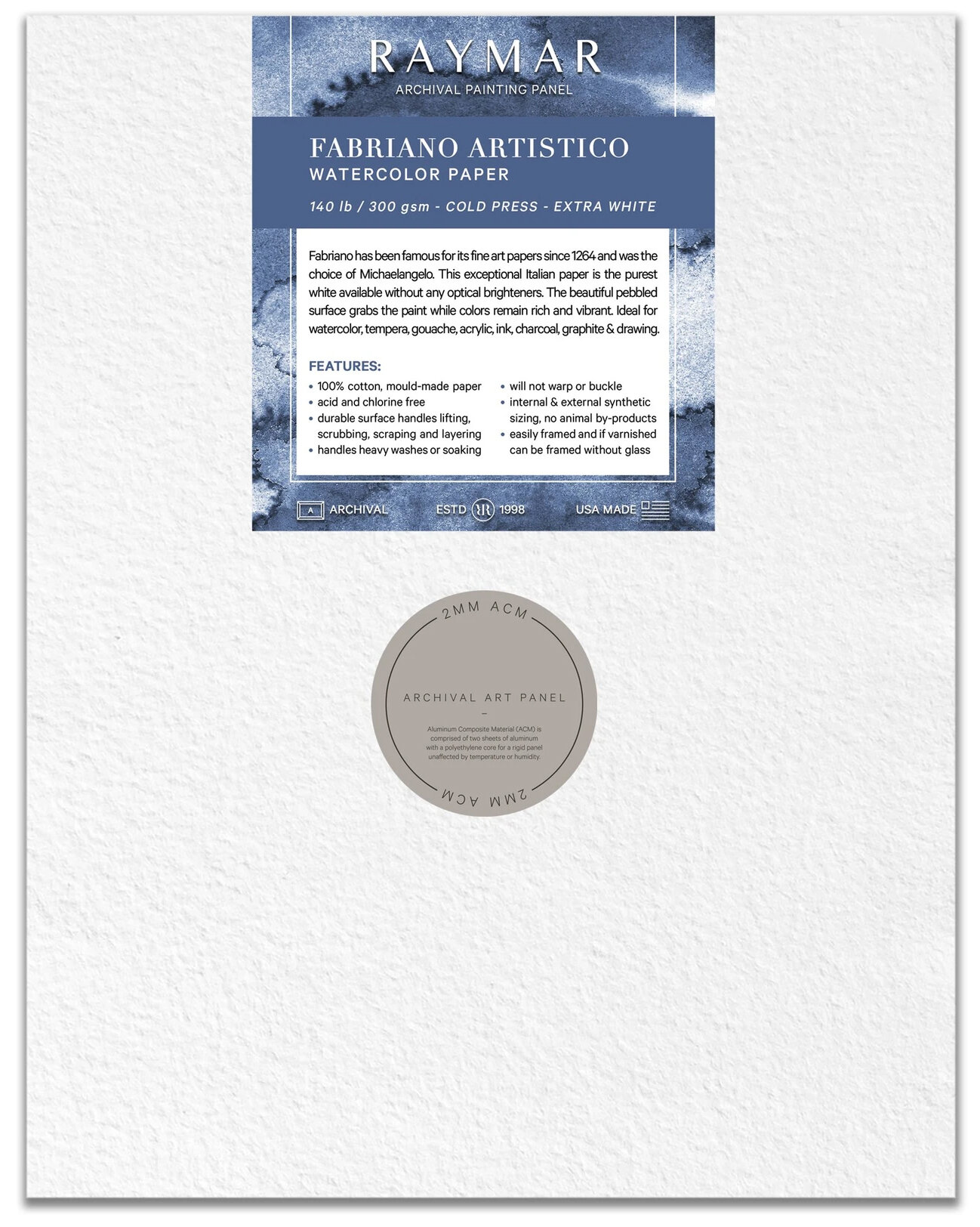
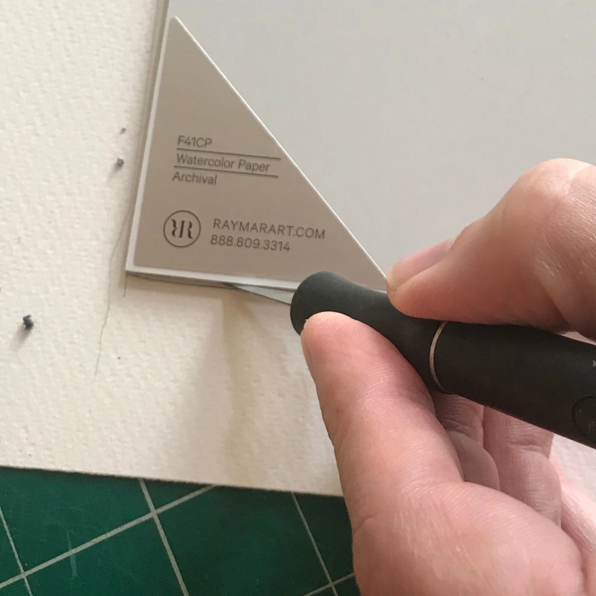
Of course, paper choice is very important for artists, and for reasons I won’t get into here, I prefer Fabriano Artistico. No matter what your preference is, the first step is mounting the paper to the panel, and I use Golden Soft Gel medium as an archival adhesive, applied in three layers.
Step 1: Brush medium to the back of the paper, and also to the panel. Take care and be sure you do not get any on the front of the paper, as this will ruin your painting surface. Allow these applications to dry separately. This creates a uniform acrylic surface on both.
Step 2: Apply a third layer of medium to the panel and fix the paper on top. The reason for this is because acrylic pressed next to acrylic will eventually bond, so even if a spot is missed when applying the third layer, you will still have a uniform seal.
Step 3: Depending on the size of the panel, it may be necessary to use a brayer to roll out any air pockets, rolling from the center out to the edges. Make sure your watercolor paper stays clean by putting a fresh sheet of tracing paper or similar on the surface, then stack your heavy art books on top and let it dry overnight.
Prepared Panels
This process can be time consuming and if you are mounting a finished painting (as I used to do) it is also very stressful. Using a prepared panel with a paper I trust has allowed me more painting time. I’ve been working with Raymar on a product that eliminates all of the work upfront. They offer Fabriano Artistico Cold Press ACM Watercolor panels in standard sizes up to 20 x 24 in. Custom sizes can also be ordered, up to 4 x 8 ft.
For me, the time saved is worth the extra cost. If I mess up a painting on a panel (and I have), it’s easy to adhere a new sheet of paper on top, using the method above, and start the painting over. The panel is not wasted. Raymar also offers raw ACM panels if you prefer to mount your own paper of choice.
After a major screw-up, I mounted a second sheet of paper on the Raymar panel and trimmed it down.
I’ve enjoyed painting on these panels for my realistic style, but there is a learning curve and it takes getting used to. If you want to try a Raymar watercolor panel, you can use coupon code BIRD20 for 20% off (note they are sold in packs of two).
Varnishing
Once you have your completed watercolor painting, you can frame the panel traditionally, or with spacers to keep the surface from touching the glass.
Or you can coat the painting, fundamentally changing the surface and how it looks. There are two points to make in this regard. If you are a purist, it’s important to understand that adding a varnish permanently changes the nature of the painting by adding an acrylic coating. There are also aesthetic changes to color, value, texture, and sheen.
The products used and the order of application in varnishing can be confusing at first, so it’s important to understand why things are done to fully understand what you want to do. It can be a simple one step process, or a more complicated, three step procedure. The decision is based on whether you want the top coat layer to be removable at a later date.
The first step in varnishing permanently locks down the water-soluble paint surface with an archival aerosol spray. There’s no way to brush on a varnish without disturbing the paint layer. (Brushing on a mineral spirit varnish won’t activate the pigment, but it sinks down into the paper, which is not what you want.)
Once the painting is sealed, an isolation coat can be applied. Then any subsequent varnish layers can be stripped down to the isolation coat, and a fresh or different varnish applied.
Why would you want to do this? Because we don’t know where our paintings will end up once they are purchased or how they will be cared for. Over time, dirt, smoke, pollen, even bugs, could build up. Or, perhaps you just decide you’d like to try a different finish than originally applied. Although not necessary, these extra steps would allow for the removal and replacement of the varnish.
I strongly recommend you practice and test throughly before trying this on a finished painting.
Step 1: Seal the painting with gloss varnish
Spray at least 6 coats of Golden Archival Gloss Varnish on your finished painting. Gloss preserves the greatest color clarity in the final result and is recommended for all early layers when varnishing. Satin or matte products can reduce the clarity due to the particulate that diffuses the light, and at early stages, this could leave a cloudy or dusty look. These products are available in aerosol cans, or in larger quantity for HVLP guns (High Volume Low Pressure). Proper ventilation is important! If you don’t have a spray booth, you can go outside, but wear the appropriate respirator.

If you don’t have a spray booth, be sure to use a well-ventilated area or go outside.
Tips:
Spray with the painting vertical or at a slight angle (not flat on the floor)
Rotate the painting 90 degrees each time to ensure the varnish covers everything. This is especially important if you use rough or cold press paper.
If using an aerosol can, shake well for 2 minutes and keep the can warm
Don’t spray from too far back, particles can dry in the air before reaching the surface
Room temperature and humidity can affect the results, be sure to read manufacturer’s guidelines.
Once this is done, you will be able to brush on the next step without disturbing or reactivating the paint layer. It’s important to note that everyone is different, and some may apply with a heavier hand, thus requiring fewer coats. But too much at once will cause drips or runs, so practice your technique.

A wet cotton swab is used test the painting is sealed.
You can use a wet cotton swab to test a corner of the painting and see if the pigment is fully sealed. Roll or brush it gently over the edge of the painting to see if there is any pigment lift. If not, then the painting is sealed and ready to move on. In traditional framing, this test area will be hidden under the frame rabbit, so if paint is lifted, it will be hidden.
Alternatively, you could tape a test strip of paper with watercolor to the side and varnished at the same time. Test this instead of the actual painting.
These coats permanently bind to the paper and technically change the surface of your painting. It’s no longer “pure” watercolor.
At this point you could and stop here (or apply Archival Matte, Satin, or Semi-Gloss for a different finish) and frame your painting as desired. The following steps are only if you want to be able to remove a subsequent varnish layer.
Step 2: Isolation coat
According to Golden Artists Colors, the definition of an isolation coat is: a clear, non-removable coating that serves to physically separate the paint surface from the removable varnish.
This is your backstop, a clear acrylic film that acts as a permanent barrier. Anything applied after this can be removed. An isolation coat can be applied with a brush or sprayed with an airbrush or spray gun. More technical info can be found on it here.
If you are pinching pennies, you can use the Soft Gel Gloss diluted 2 parts Gel to 1 part water in lieu of the Isolation Coat product.
This coat will dry clear, although depending on how thick the application, it may appear milky at first. The isolation coat should cure for 1 day before Polymer varnishing, 2-3 days for MSA since there is a switch from water-based to mineral spirit-based product. It is important not to trap water under the varnish.
Step 3: Varnish top coat(s).
This step is where you have lots of options, not only in the aesthetic finish (gloss, matte, satin) but also application via brush or spray, and mineral spirit acrylic (MSA) or water soluble polymer.
GOLDEN MSA Varnish w/UVLS: Mineral Spirit Acrylic (MSA) with UltraViolet Light filters and Stabilizers (UVLS) can be the same product used in step 1 to seal the painting. It comes in an aerosol can, or you can mix your own and use a HVLP gun. The formula for this dilution is 3:1 varnish to solvent for brush, 2:1 for spray. If using a brush application, MSA levels out more evenly because it is a mineral spirit based resign.
GOLDEN Polymer Varnish with UVLS: This is a water-based acrylic polymer varnish also with UVLS to provide protection from ultraviolet radiation. The formula for this dilution is 4 parts varnish to 1 part water for brush, 2 to 1 for spray.
At Golden, they use a QUV accelerated weathering tester that reproduces the UV damage caused by sunlight that occurs over years. The MSA Varnish was tested for three different durations: 400 hours (33 years of gallery lighting), 800 hours (66 years), and 1200 hours (99 years) and the protection was shown to be almost identical to Tru Vue Optium Museum Acrylic protection.
Both of these products are available in gloss, satin or matte finishes, and both are removable for conservation purposes.
The choice of application is a personal one. The best way to achieve an even coating of varnish is to spray apply. But that is not always practical and I prefer to use a brush. I use a da Vinci soft synthetic hair mottler, (flat wash, short handle, size 50) and apply with the painting flat so there is no running. A little goes a long way, so don’t submerge the brush too deeply. Keeping the varnish from under the metal ferrule will make it easier to clean and extend the life of your brush.

Framing
Now for the easy part! No longer is framing a tedious chore of cutting and assembling mat boards, backing sheet, plexi and dust cover. I pop the panel into a frame and hang it up.
If you want to go for extra credit, conservators will love you if you adhere a sticker to the back of your painting that details the layers and products you have used.
A Note on Exhibition
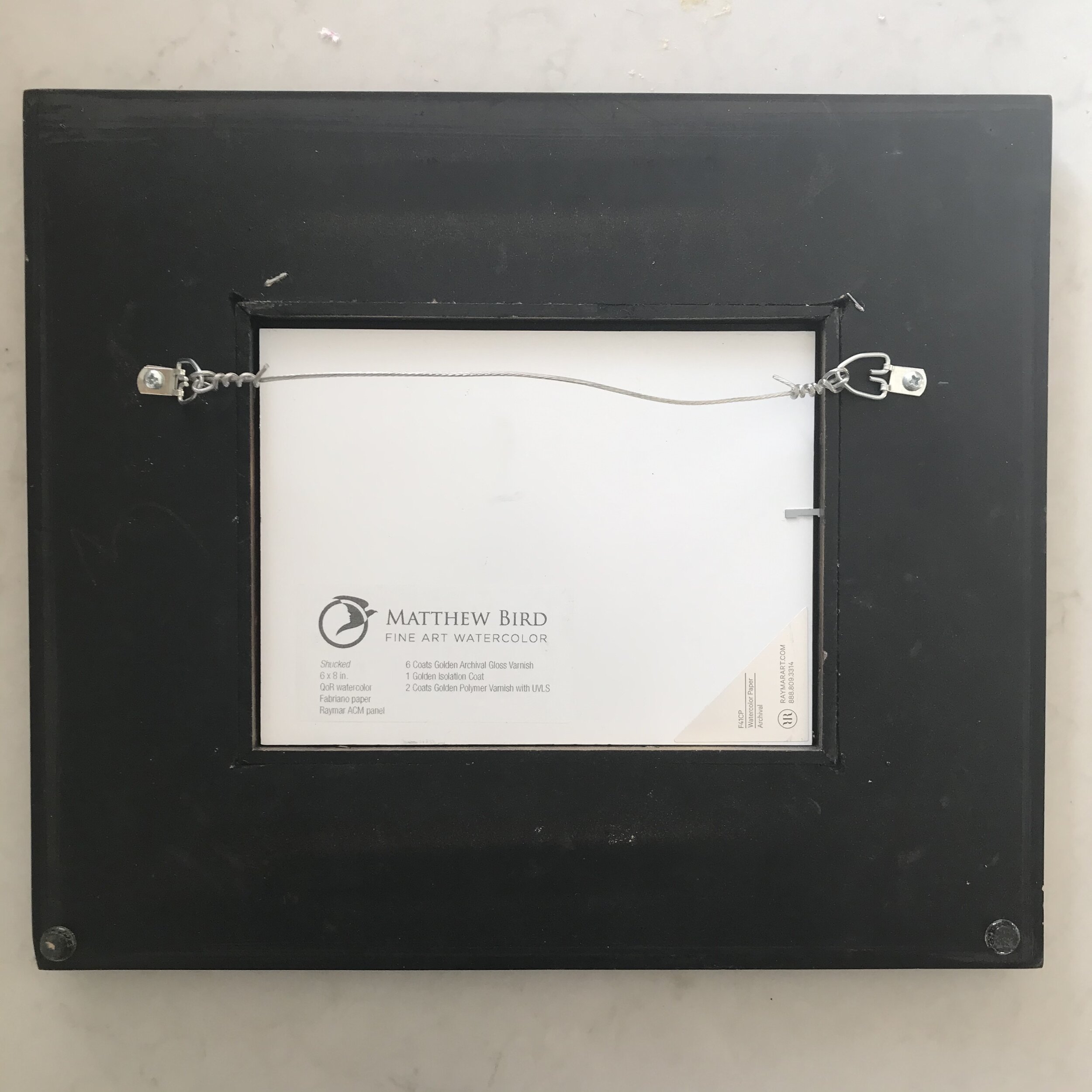
Conservators will love you if you document your process on the back of your painting.
More and more watercolor societies are allowing varnished watercolors. Obviously, any group that allows mixed media would accept it, but be sure to read the framing requirements in the prospectus, plexi may still be required. For those interested in exhibiting in society shows, I keep a growing list of organizations that accept coated paintings, which include :
National Watercolor Society
American Watercolor Society (maybe varnished, but plexi required if included in the travel exhibit)
Watercolor USA
If you know of other major shows that allow varnished paintings please let me know or leave a note in the comments.
Coating watercolor remains a new frontier for the medium, and while it is not for everyone, the door is open wide for those who wish to safely display and sell their work without glass, using archival techniques.
I am thankful to Cathy Jennings and everyone at Golden for their time and expertise in testing these products. I am also thankful to the handful of artists who have shared information with each other in the search for quality results.
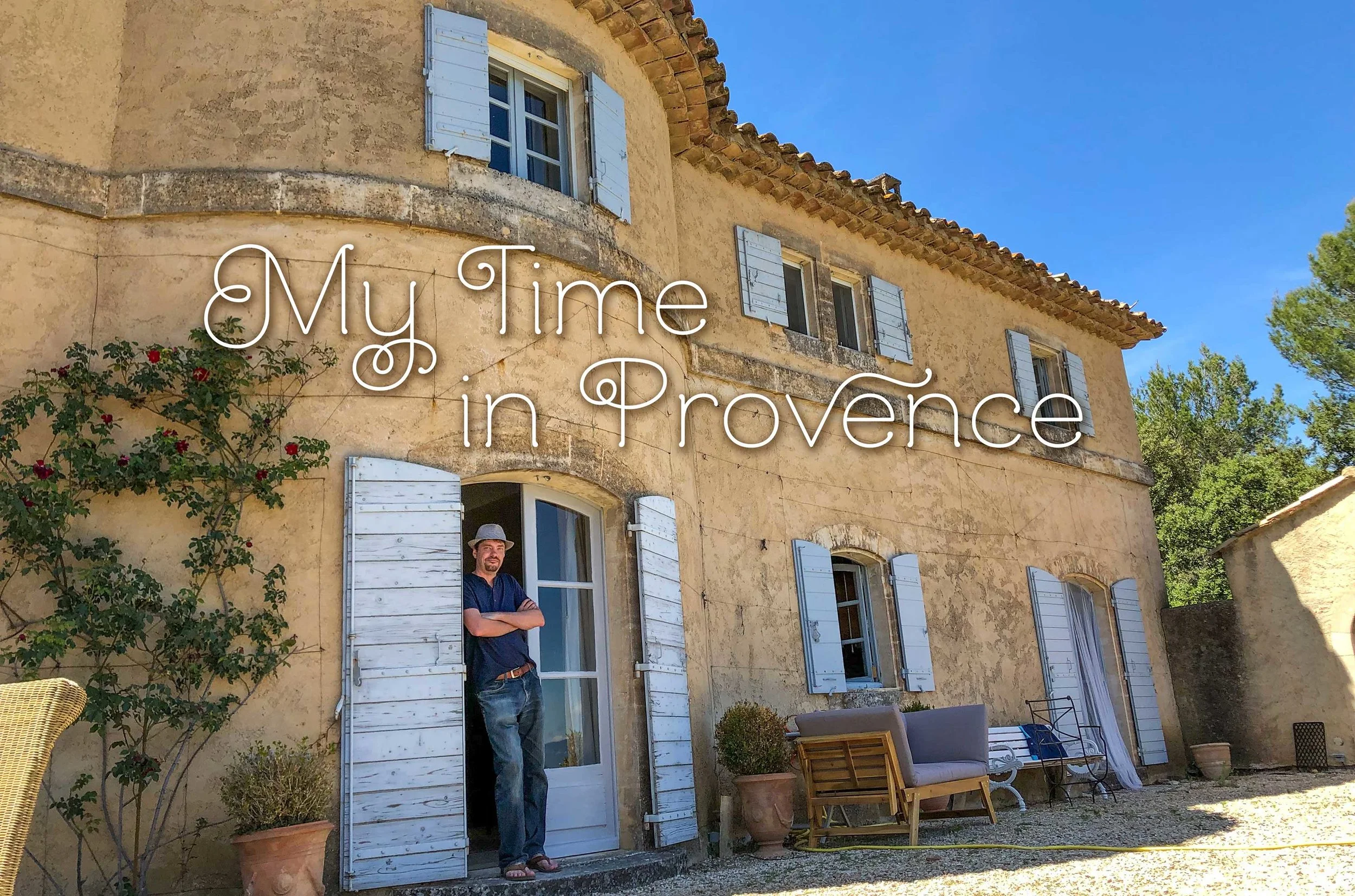
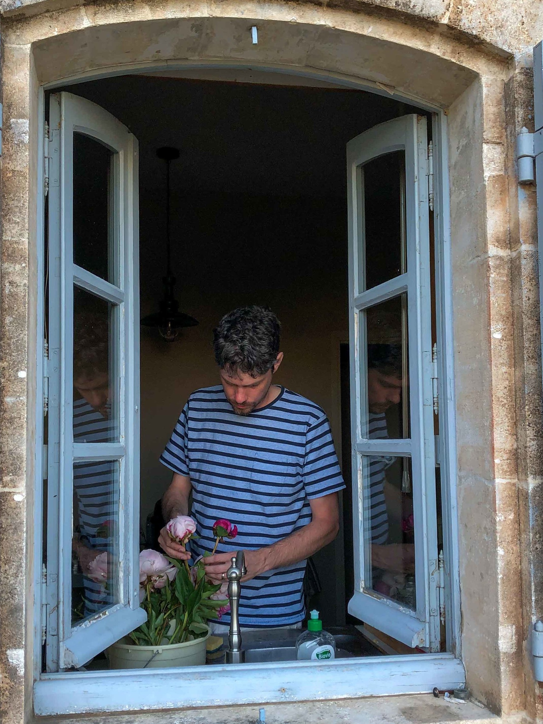
My Time in Provence
The Dream
“Do you want to stay in our château in Provence for a couple of weeks in exchange for a painting?”
That was the question I received when Angela called one Sunday afternoon.
She went on to tell me about a house in the South of France, the pool, the village, Ridley Scott and Peter Mayle, but I didn’t need a whole lot of convincing. I was hooked right away.
I did not know Angela, we have never met, and I probably would have thought this whole thing was a scam if it weren’t for Tracey Norvell, a mutual friend in the art world. My name was on a list of artists that might be available for commission work, and I was the fortunate one that got the call.
Artists have been drawn to Provence since ... forever. Cézanne, Van Gogh, Gauguin, Picasso, Signac, Matisse, just to name a few. It’s a magical place and of course I wanted to take this job.
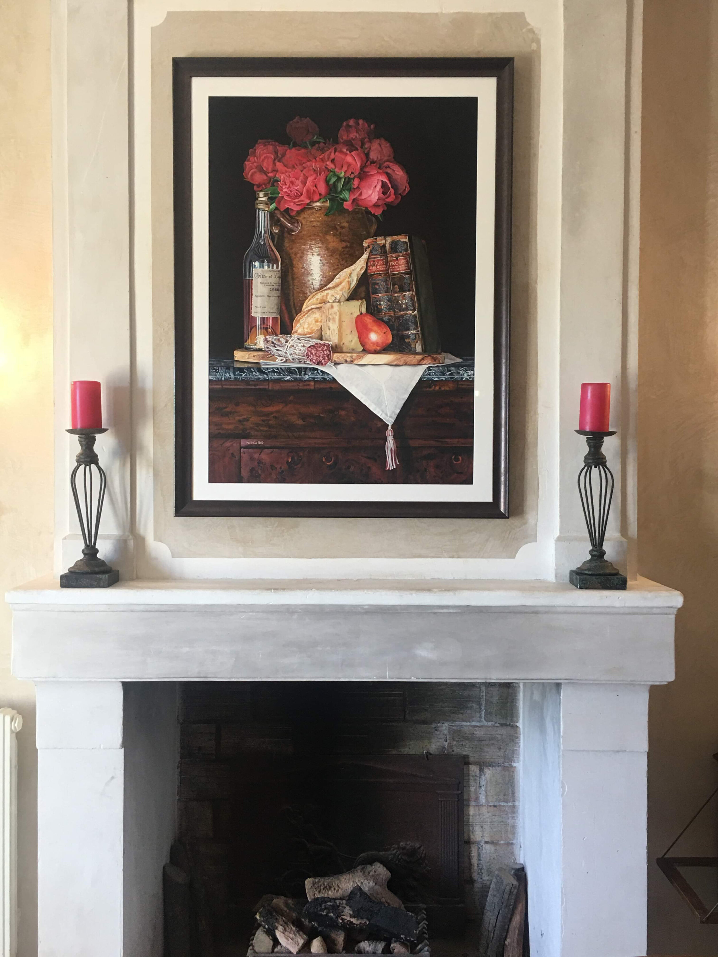
The Commission
I received a photo where the painting was to be hung, and the wall measurements. Angela requested a still life featuring local, Provencal items, including pottery. She was also partial to the color red. That was pretty much what I had to go on, and my goal was to merge her affinities with my painting style.
The House
The château was outside of Menerbés, a village in the Luberon valley. We didn’t know a whole about where we would be staying or what it looked like. Angela’s son Sanders named the home La Maison de Famille, or The Family House, and it turned out to be perfect for our family visit. Everything about it was lovely and the views were beyond expectations!
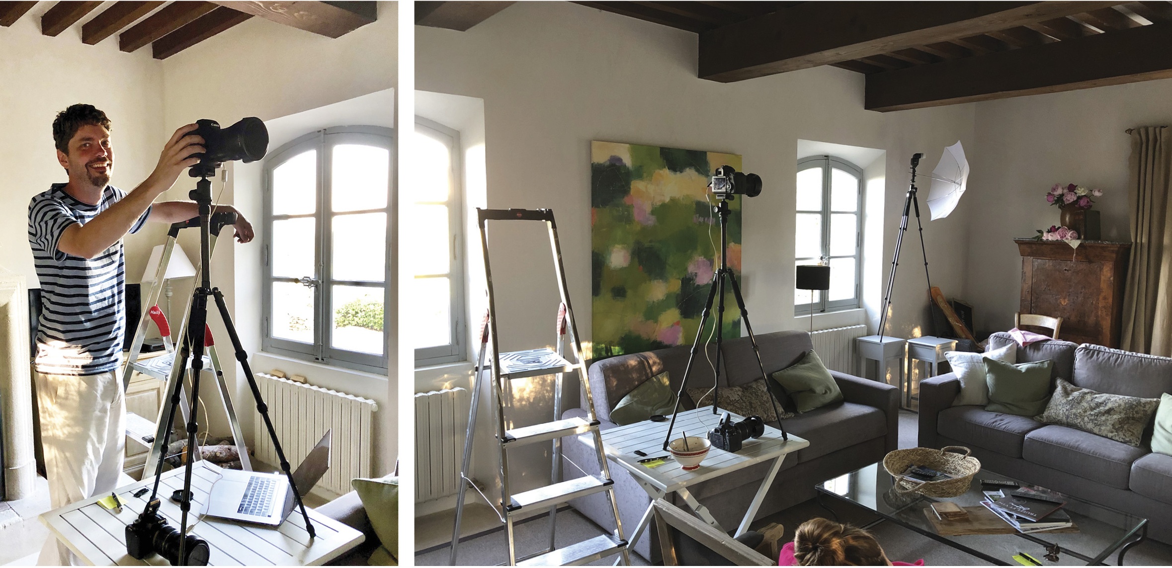
After getting settled, the work began in earnest. I explored the house looking for a table or shelf where I could stage the still life. I also was watching the light and made notes on what I liked, where, and the time of day.
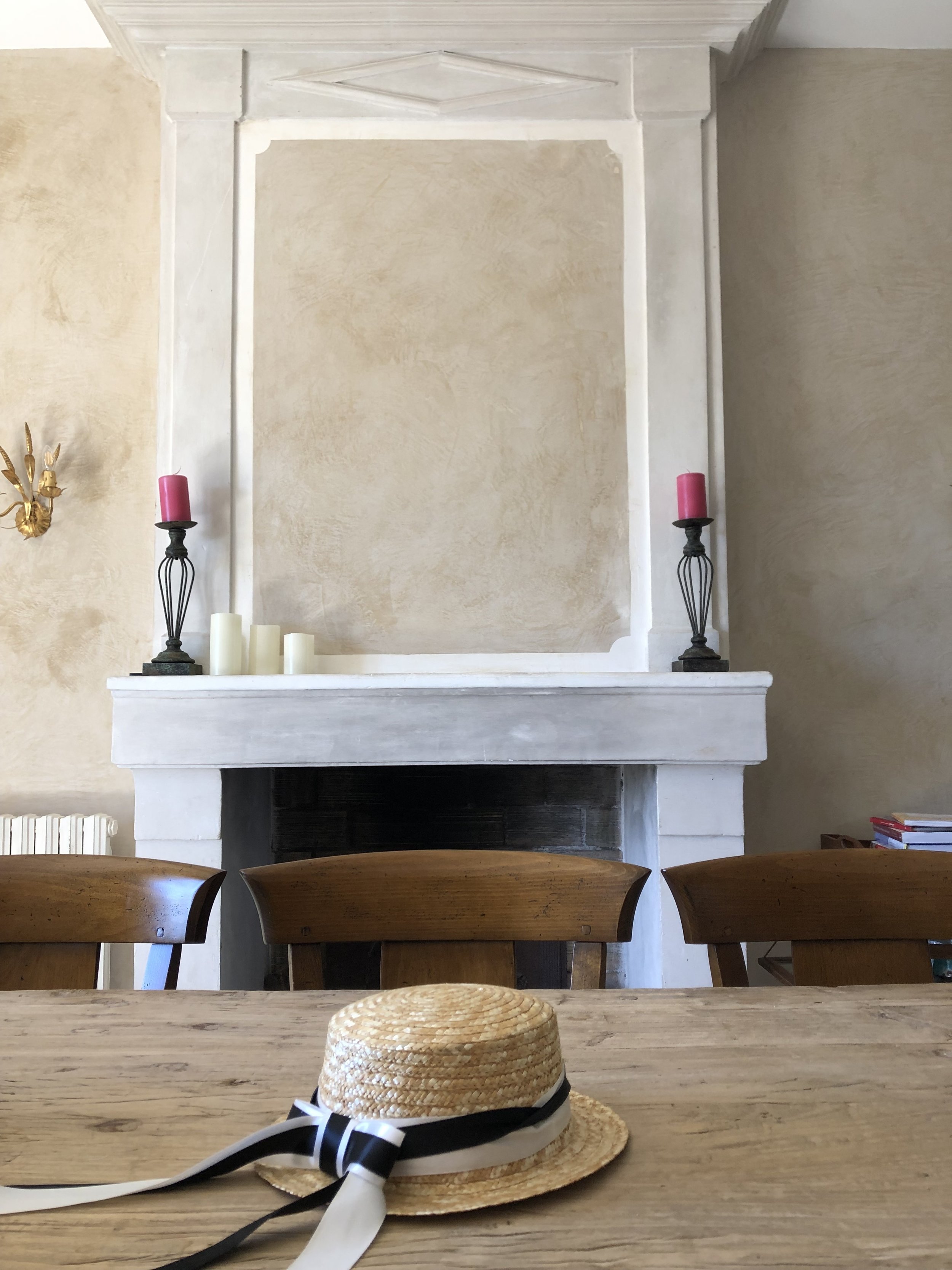
I fell in love with an antique desk that was in the corner of one of the rooms. The rich burl wood was beautiful and there was a marble top with abstract shapes and textures that would be a fun challenge to paint and add to a rich composition. The desk was too big and heavy to move anywhere, so this would have to be the spot. It was also rather tall, but I would figure out a way to make it work.


The Markets
All the towns in Provence have their own market day at different times during the week. My plan was to visit as many as I could and gather elements that would make an interesting composition.
For a still life painter like me, Provence proved to be a gold mine of wonderful things to paint. Walking through the markets, I was literally overwhelmed with the inspiration I found everywhere. Picking up one object I would start envisioning a painting, only to turn a corner and find some other amazing baubble that deserved attention.
With the help of my astute wife I was able to stay on task and bring together more than enough for a great painting.

I found the Provincial linen table runner and antique pot in Bonnieux. The peonies were from Goult. The cutting board is made of local olive wood, and was purchased from the market in L’Isle-sur-la-Sorgue. Famous for antiques, this town had unique things I wish I could find in the States.
The bottle of Armagnac was found at the house, I loved the look of it, and hopefully its inclusion adds a special personal touch. Armagnac is a distinctive kind of brandy produced in the Armagnac region in Gascony, southwest France.
The old books were found in the upstairs library. I changed them to be by Proust, which fit the French theme perfectly. À La Recherche Du Temps Perdu (In Search of Lost Time) is probably his most famous work.
The black truffle cheese, baguette and red pear were from Ménerbes, our favorite of all the towns we visited, and the village upon which we watched the sunset every evening.
The Setup
I purchased more than I would need at the markets, and tried various things over several days. For example, I had other flowers in mind, before finding out that Angela’s favorites were peonies. Red peonies if I could find them.
As I mentioned, the antique desk is quite tall, and I had to bring in a table and ladder to get my eye line correct. Eventually I got everything just right…

The Painting

This Provencal Life is one of the largest still life paintings I’ve ever done. After living in the intended room, and seeing how high the ceilings were, I realized I was going to have to paint larger than anticipated in order for it to really work properly in the space.
The painting is 29.5 x 41 in. (75 x 104 cm) on Fabriano Artistico 300 lb. cold press watercolor paper. I used Daniel Smith paints, and Escoda brushes.
. . .
My time in Provence was nothing short of life-changing, and I am forever grateful to Angela for giving me and my family the opportunity. It is my wish that every artist could experience the combination of dappled light, mistral winds, and delightful food and wine that somehow usurp your daydreams, knowing that one day, you must return!
If you or someone you know would be interested in commissioning a meaningful painting of your collectables or family heirlooms, please contact me for more information.
UPDATE:
Things in Provence move at their own unique pace, much like the tales of Peter Mayle. And so it was with the framing and installation of this painting. Eventually it all came together and This Provencial Life now hangs in the château’s dinning room above the fireplace.
Doubling the size of my initial concept proved to be the right decision; the painting fits perfectly in the space and serves the room properly. We are all delighted with the final result. I hope you agree!

The view of Menerbés
The New Watercolor Panel by RayMar
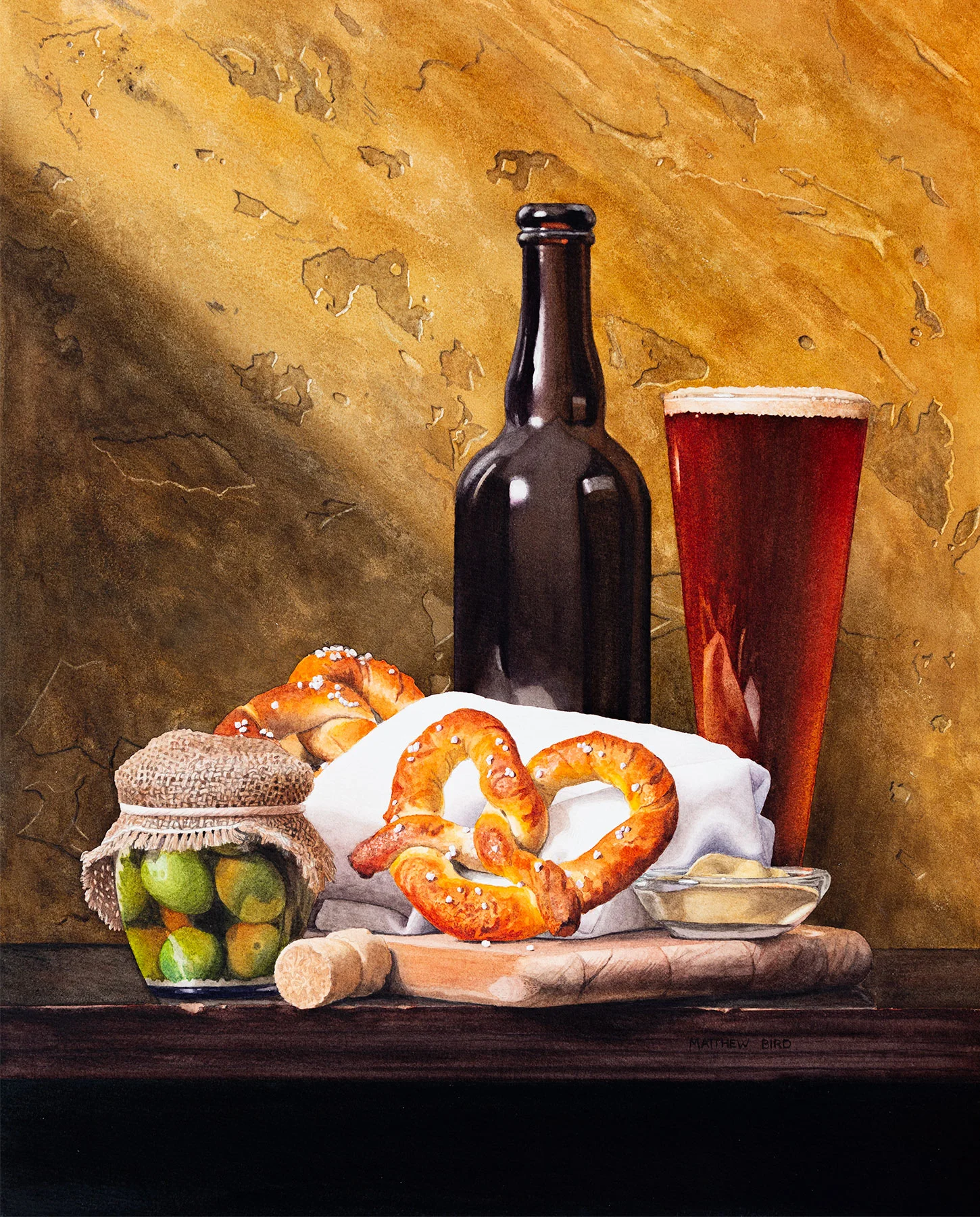


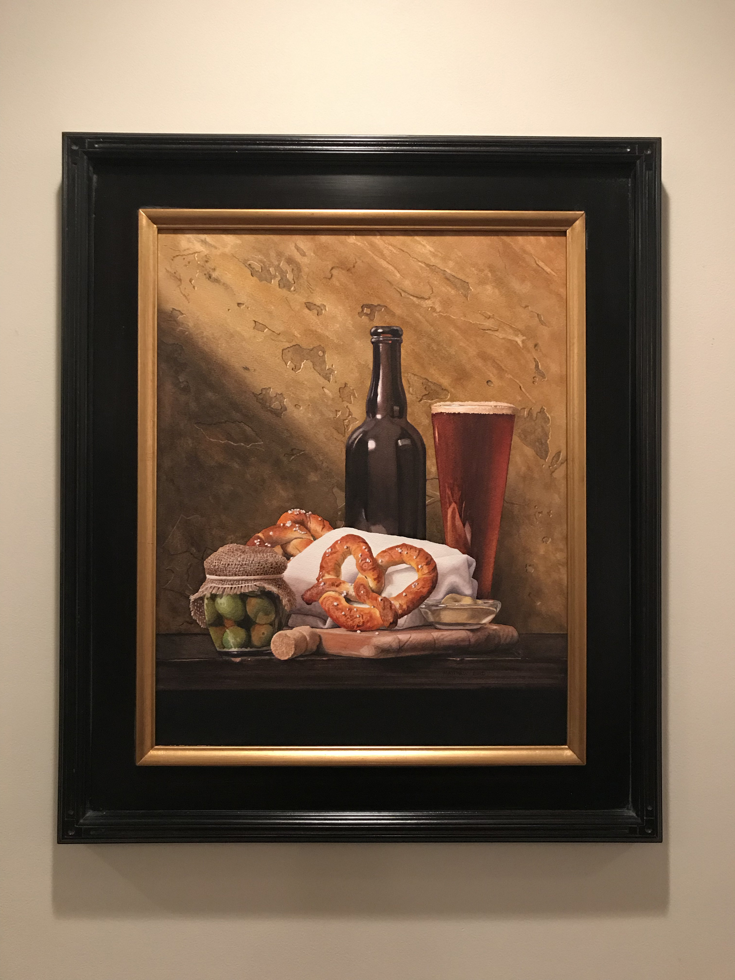
Beer & Pretzels
16 x 20 in.
Watercolor on paper
Available through the artist
My most recent painting, Beer & Pretzels, was a special new product test and I'm happy to share some exciting news!
I've been working with RayMar Art, Inc. on a new product for watercolor artists: an archival, lightweight watercolor panel. They have combined the Fabriano paper I normally use with an ACM panel (aluminum composite material) and the results have been great!
Those who have been to my workshops know I've been making my own panels, mounting paper to aluminum, for a few years now. It's been successful, but it's laborious and time consuming, especially for large work. Being able to purchase pre-made panels would allow me to spend more time doing what I love to do — paint!
RayMar's interest in exploring this possibility has been refreshing. Every product they make has been in response to artists’ needs. Their customer base is oil and acrylic painters, but I think watercolorists might really enjoy trying this product, and I'll tell you why.
Normally I paint on 300 lb. paper, and the primary reason for this is because I don't want to waste time stretching lighter weight paper. I'd rather be painting! Still, even heavy paper will buckle a little. None of this happens on the panel. It's effectively pre-stretched and always remains flat wash after wash. Even when completely submerged there’s no deformation.
RayMar panels are archival. This one uses Fabriano Artistico Extra White, which is 100% cotton, mould-made paper, free of acid and chlorine. Fabriano paper has been made since 1264 and was the choice of Michaelangelo. So yeah. It’s good paper.
I’ve found it to always be properly sized — I’m looking at you Arches — and without issue. The paper used for the panels comes off a roll, so there is no watermark to speak of, which is another plus.
The aluminum composite material (ACM) is comprised of two sheets of aluminum with a polyethylene core to create a rigid panel that is unaffected by temperature or humidity. (More on why I like aluminum here.) The panel is only 2 millimeters think.
It’s also very lightweight, which makes it affordable to ship and easy to carry in the field.
What are the drawbacks to a watercolor panel? I noticed a slightly longer drying time, due to only one side of the paper being exposed to air. Not a big deal for my process, but worth noting. And it’s more expensive than a sheet of paper.
There’s also the problem of exhibitions. Many watercolor societies require watercolors to be displayed with a mat. While not impossible, it would be more challenging. I prefer to use spacers to keep the glass from touching the surface instead of a mat, as shown on the right.
When I finished Beer & Pretzels, the first thing I did was pop it into a frame. 16 x 20 inches is a standard size and I had a frame on hand. It’s fast and easy to use museum glass with spacers, or varnish and display with out glass. Alternatively, they could be used with a floater frame. Either way, I don’t have to cut a mat. (Read more about my varnishing techniques here.)
These panels, with various paper surfaces, should be available soon. RayMar sells through their website, as well as other venders, so keep an eye out for this exciting new product.
Let me know what you think! I’m sure there are things I haven’t thought to address, so let me know what questions you have.
Happy painting!
A Place to Belong

A Place to Belong
One of the most difficult aspects of being an artist is the hours of solidarity. After pouring weeks into a piece, artists then need to put on their marketing hat and sell the work, hopefully avoiding the starving artist trope. Then go back into the studio and do it again. And again.
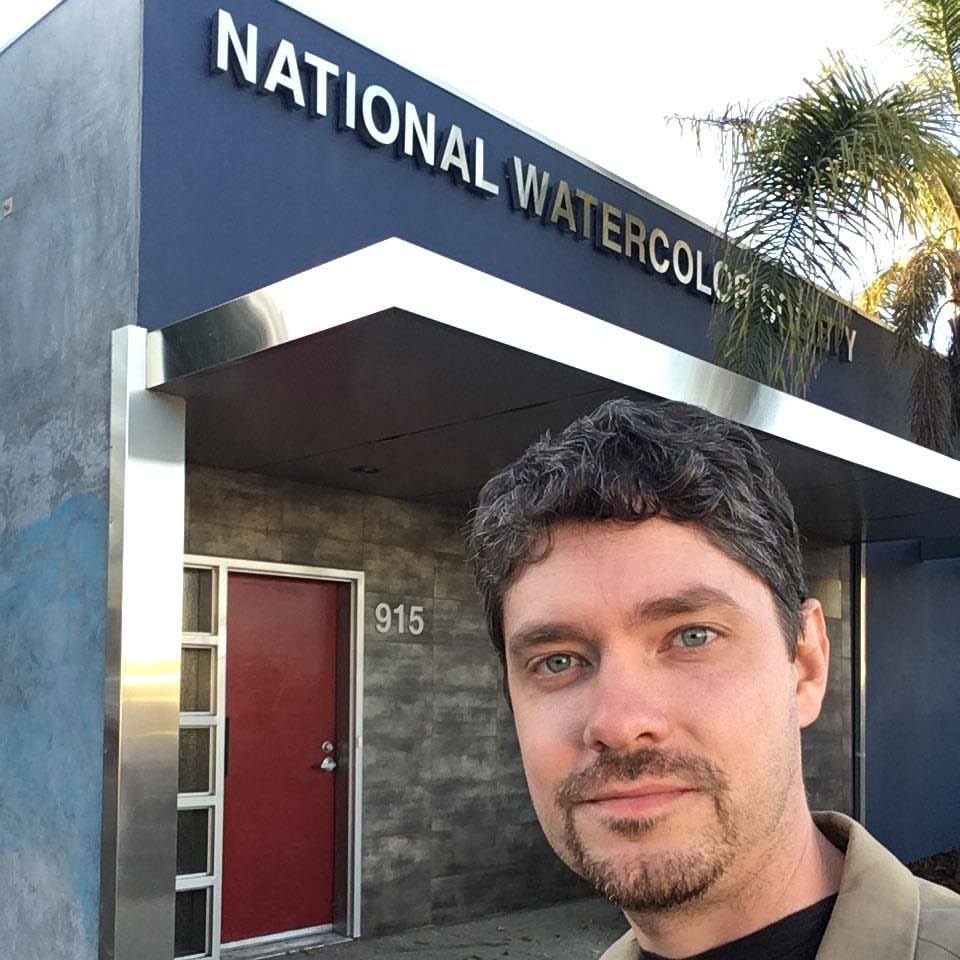
I thought this was how it worked until I discovered the value in connecting with the right art societies. In my case, one of those groups was the National Watercolor Society (NWS).
I can say definitively that NWS and the people I’ve met have greatly helped my career as a professional artist. The exhibitions, mentoring, and motivation have been the springboard for opportunities, growth, and advancement.
NWS recently opened their 98th International Exhibition in San Pedro, California. Visiting the exhibition reminded me of not just the importance of these shows on a cultural level, but also the value of connecting with our peers.
“Everyone attending understands the language of the artist,” says NWS President Robbie Laird, “that solitude is necessary when we create, and the balance of that solitude time is to be with others who understand.”
Attending these sorts of events can be very rewarding, even if you are an artist who doesn’t have a painting in the show. It’s a great opportunity to network, see old friends, and make new ones. It is also a time to be inspired and challenged in new ways by being around people that do things differently than you do. By attending you will likely up your game, meet painters you’ve long admired, and see museum-quality artwork up close instead of on a little screen.

Karen Heidler, of Brooksville, Florida, poses with her painting at the exhibition
In the words of exhibiting artist Karen Heidler, “Meeting the artists at the NWS International Opening Reception was just as exciting as seeing the exquisite paintings they produced!”
As with much in life, there can be great value and reward in just showing up. Yes, it can be unnerving to walk into an event when you don’t know anyone. That was my experience four years ago when I had my first painting accepted into the show. We had young children and many responsibilities, and I almost didn’t fly out for the opening. But attending that exhibit gave me the hope and direction I’d been missing. It was during that weekend that I made amazing friends and connections that led to other opportunities, one of which is serving on the NWS Board of Directors.
I’d be remiss if I didn’t point out that NWS has been promoting water media for 98 years all through the efforts of volunteers. As the centennial anniversary approaches in 2020, there are many more exciting events and opportunities on the horizon, and there’s no better time to get involved.
NWS is a national organization with board members and volunteers from all over the country. To learn more, visit the NWS website. Also, please feel free to reach out to any board member about how you can get involved.
This article was featured in Artists on Art Magazine and American Watercolor Weekly
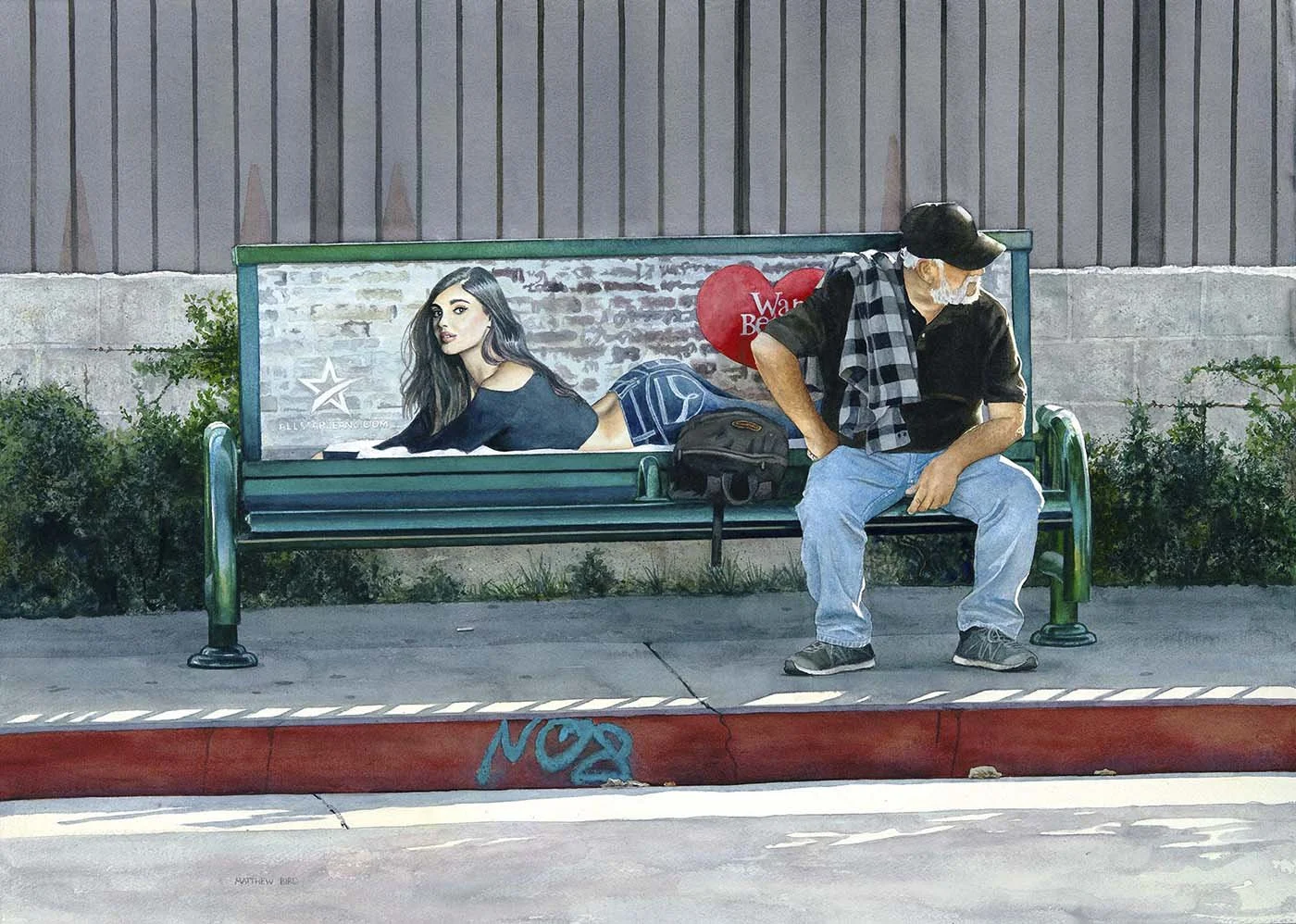
Not Interested
Not Interested
Watercolor on paper
30 x 22 in.
Last month I returned to Los Angeles for an art opening and passed the spot that inspired my painting Not Interested. Unsurprisingly, the advertisement on the bench was largely unchanged after twelve months. The model was different, but the marketing was the same. And I see this in every city I visit.

Having worked in marketing for 15 years, I’ve always been interested in the drivers that motivate people, many of which are dishonest at worst, or manipulative at best. I saw this advertising campaign for women’s jeans on benches around Los Angeles. The image had been Photoshopped to a ridiculous degree — beyond the basic touch-ups that have become the norm. The model’s body was curved to an impossible angle. It’s an overly sexualized image, which would largely appeal to men, but is being used to sell a product to women, which will seemingly make them appealing to men.
Too often, advertising uses the low hanging fruit of insecurities in an attempt to make women feel inadequate while at the same time distorting how men understand beauty. Without getting too philosophical, I was fascinated by the idea of this guy sitting there, completely uninterested in the marketing ploy, and thought it perfect for satirical commentary.
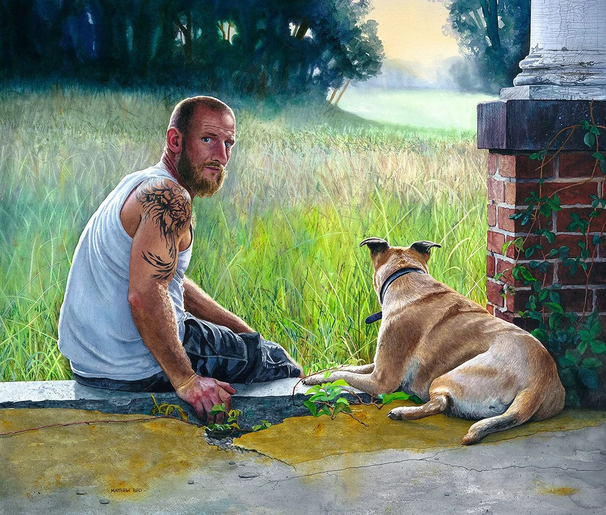
Looking Forward

Looking Forward
28.75 x 25 in (73 x 64 cm)
Varnished watercolor on paper, mounted on aluminum panel.
Available through the artist
I’m honored to learn that Looking Forward has received the FIG Award in the San Diego Watercolor Society’s 39th International Exhibition. Thank you to juror John Salminen and to all the volunteers that work behind the scenes to make the show possible.
This is a painting of my neighbor Matt and his mutt. Matt is a great guy who has recently come out of a very rough time in his life. His wife got into drugs and alcohol, went to prison, rehab, divorced him and left him a single father of an eight-year-old girl. Through it all, his dog Nala was by his side. Near our neighborhood there is an abandoned hospital campus, built around 1900. Running throughout the hospital grounds with Nala became therapeutic for Matt, and it’s where I decided to have him sit for the painting.
I love it when I can take a portrait beyond the simple likeness of a person and convey a bit more of their life. In this case, I wanted it to be more than just a “reverse rescue” story.
The foreground setting is the run down, decaying structure of the past, which moves to a bucolic, hopeful landscape. There’s a sense of the tension and stress of life that Matt has been living through; seen in his gaze and furrowed brow, and in his hand as he grips the crumbling stone. But there’s also an optimism in what lays ahead. He’s subtly back lit, rimmed in light. His dog is next to him, but not asleep—alert and watching.
“This painting succeeds both as a landscape and as a portrait,” says Juror John Salminen. "The artist has provided a wonderful obstacle course to draw the eye into the space and ultimately move it to the light.”
To me, Matt is taking one last look to the past with a face of strength and determination, and Nala is helping him look to the future—reinforcing that Matt isn’t starting over, but moving forward.
A Great Tip for my Watercolor Pein Air Friends
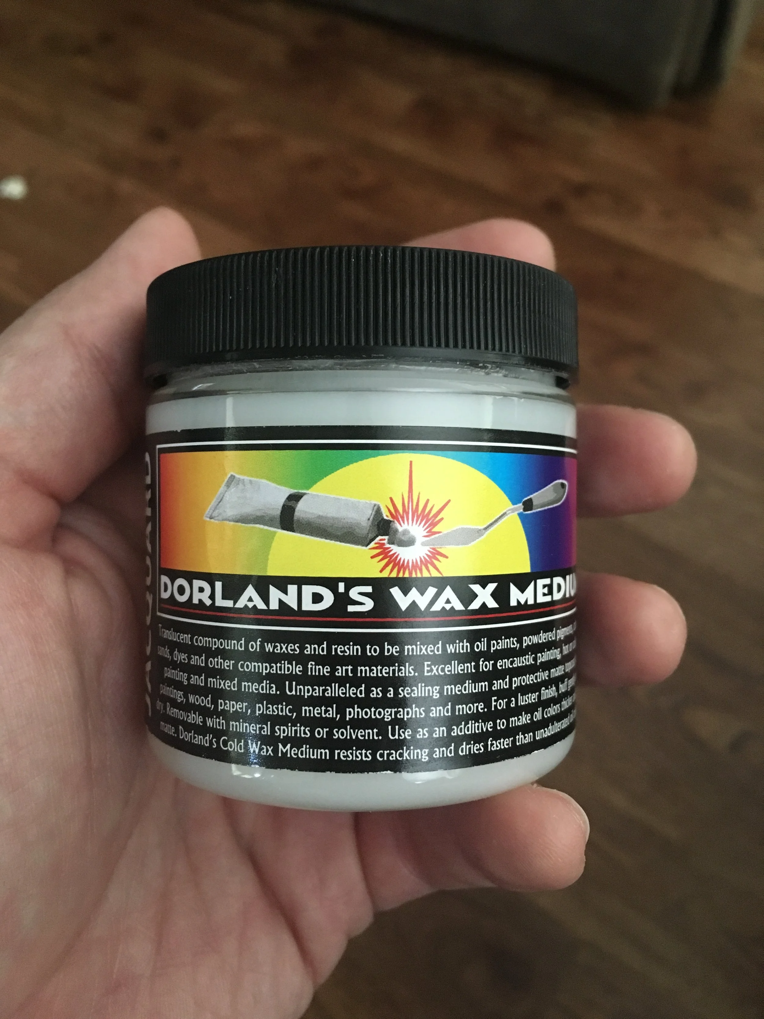
2020 UPDATE: I’ve been getting conflicting opinions from conservation experts about using wax as a varnish, some cautioning against it. While the beautiful, soft matte finish is still my favorite, I am exploring other methods and it would be remiss of me not to mention that some in the restoration community don’t recommend it.
Recently one of my friends, who's an accomplished plein air painter, came over for a studio visit. He was invited to participate in Plein Air Easton, the largest and most prestigious juried plein air painting competition in the United States and had some questions about coating watercolors.
For those that don't know, the competition consists of 50-60 painters, selected to produce art on location in Easton, Maryland (located on the Chesapeake Bay) and paint for six days competing for over $30,000 in prizes. The paintings are then juried and put up for sale. Last year art sales were close to $400,000 with 301 paintings sold in 2.5 days.
It's kind of a big deal.
Like any other painting genre, the plein air community is predominately made up of fantastic oil painters. So how does a watercolorist, whose work is traditionally framed under glass with a mat, create paintings and frame them quickly so they show well next to our oil painting friends?
Varnish that puppy right on the spot in a matter of minutes and forget the glass.
Here's my suggestion that is quick and easy. Prepare (or buy) several watercolor panels in a size typical for your work. Let's say 16" x 20," something that can travel easily. See my post about mounting your favorite watercolor paper to a panel here.
Once you know your size constraints, get yourself a couple handsome frames, perhaps with a linen liner if you want to take it up a notch.
Now for the pièce de résistance: Dorland’s Wax Medium. This non-toxic, bees wax medium can be used as a finishing varnish directly onto a watercolor painting. That's right. It does not disturb the watercolor at all! It's clear, archival, and dries fast. Plus, it comes in a small 4 oz. jar (for about $8) which makes it easy for traveling, even on an airplane.
Since you are painting on prepared watercolor panels already, once your painting is signed and throughly dry, you can apply the wax right away. Use circular motions, like The Karate Kid, only much smaller circles. It dries quickly to a matte finish. It's not a high gloss, although you can add more and buff it for a luster finish, if desired.
Throw your new masterpiece into the frame and you're good to go. It's the easiest, fastest way to coat a watercolor painting that I know of. Give it a try and let me know what you think!
The Color of Water

This February, Kathryn and I flew to Charleston, SC, to be part of Robert Lange Studio's "The Color of Water" group show opening. The show celebrates the growing field of contemporary watercolor and features 20 artists from around the globe. I was delighted to learn that NOLA Beetle received the Editor's Pick from Art Mag.
The show is dedicated to the beauty and complexity of the watercolor medium, and Robert's toast opening night summed up the show nicely (below). I first visited Robert and Megan’s gallery in 2017 and you must stop by if you are ever in town; you will leave with a greater love for art. (Plus, not many galleries have an indoor swing or a grand piano that you’re encouraged to play.) I greatly appreciate that they are running a business voted Best Art Gallery in Charleston 2010-2017, while being incredibly talented artists themselves.
All are welcome here, and it’s an honor to have my paintings on the wall along side of Laurin McCracken, Dylan Scott Pierce, Alexandra Becker-Black, Joshua Flint, Kerry Brooks, Mario Robinson, Jason Drake, Nick, Runge, Endre Penovac, Kevin Taylor, Oriol Angrill Jorda, Katie Green, Adam Lister, Ester Sarto, Michiyo Fukushima, Karl Mårtens, Denny Bond, Melanie Norris, Reuben Negron.
The exhibition will hang through the months of January and February.


Photos from opening night, February 2, 2018.